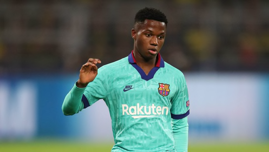
After a few years of playing it safe and sticking to template designs, Nike have pulled some incredible kit concepts out of the bag this season, most notably with clubs' third kits.
Featuring the 'Futura' logo of the 1990s, Nike have really gone to work to ensure some incredible memories will be made in some incredible kits. No doubt that some of these strips will be turning up in 'classic football shirt' listicles long into the future.
So which one is the best of this beautiful bunch? Here's eight Nike kits featuring the Futura logo this season, ranked in order of brilliance.
8. Galatasaray
— kitstown (@kitstown) September 17, 2019
Nike × Galatasaray SK 2019/20 new third kit. #GalatasaraySK #Galatasaray #AslanKükre #AlwaysForward #NikeFootball #football #soccer #kitstown pic.twitter.com/EqgTvnmtQy
Listen, this is just simply the worst of Nike's signature collection this season and there's no two ways about it. The grey isn't a striking silver, the stripes aren't aligned, and overall, it's particularly
7. Atletico Madrid
[⚪] BELIEVE AND WIN
— Atlético de Madrid (@atletienglish) September 13, 2019
HERE IT IS! Our new third kit for the 2019/20 season!
‼❕‼ Available at all our official stores
https://t.co/ECmJUhhnRP#AúpaAtleti pic.twitter.com/Y9W6NsIdSY
We'll come to some cracking sky blue designs later in this list, but unfortunately for Atletico Madrid, they've been lumped with what looks like a rejected version of Manchester City's home kit.
The pattern doesn't have any hidden meaning like some counterparts in this list, and the high collar is a big no from this direction. At most, it's alright.
6. Chelsea
Introducing the new @nikefootball 2019/20 third kit!
— Chelsea FC (@ChelseaFC) September 4, 2019
Taking inspiration from the 1990s, the shirt features colours from one of the club’s most unforgettable away strips and the Nike Futura logo reflecting iconic kits of the past. #ITSACHELSEATHING
https://t.co/lnBtcXDP8A pic.twitter.com/nq1vzPTEfK
This article is 80% moaning about the high collars. Seriously, why? A subtle nod to history some may say, but it's a design aspect that should remain there.
However, Chelsea love a bright colour on their changed strips, and the orange is similar to those worn on their adidas kits at the start of this decade. The 'CFC' imprinted over it like tyre tracks is a decent touch as well.
5. Tottenham Hotspur
Our third kit for 2019/20.
— Tottenham Hotspur (@SpursOfficial) September 4, 2019
Available to buy now https://t.co/7eNlRAZFeU#MadeOfTottenham ⚪️ @nikefootball pic.twitter.com/3Jcu5LNDKY
Fifth place may seem harsh on Spurs here, but it's down to the ones higher in this list being so utterly brilliant.
Tottenham's bright blue number will have many of their fans wanting to be in it, reminiscent of many of their more famous changed strips. The pattern gets double points for resembling the outside of their new stadium and spelling out 'Spurs'.
4. Paris Saint-Germain
Shirt Alert: PSG have released their new third shirt
— Classic Football Shirts (@classicshirts) September 14, 2019
The third shirt is to celebrate 30 years of PSG and Nike and is based on the original home kit from 1989. pic.twitter.com/UhpXTuggJT
It's smart. It's so smart. The collar, the complimentary club colours, the 'PSG' pattern running diagonally.
The shame for the French champions is that it will forever be associated with wearing an all-white kit at home to Real Madrid. Not on. Sort it out.
3. FC Barcelona
They look
— FC Barcelona (@FCBarcelona) September 12, 2019
@3gerardpique & @JuniorFirpo03
3rd KIT pic.twitter.com/EuWyn2koCj
Look at you, Barca, coming in here and looking like a loading screen from Grand Theft Auto: Vice City.
Nike's take on their Kappa kits of the 1990s is sensational, huge collar included, while the city's coat of arms pattern completes a dashing look.
2. Internazionale
| NEW KIT
— Inter (@Inter_en) September 9, 2019
✅ Shirt
✅ Shorts
✅ Socks
https://t.co/MyVy0yN9eL pic.twitter.com/4K2xwUgaKs
Any other year and this would be considered the greatest kit in all of sports history. Sadly for Inter, they have to settle for our runners-up spot.
The black is a clean black, the contrasting yellow is the perfect contrasting yellow, and while Inter fans would probably not adorn the red of their city rivals, it completes an iconic club/sponsor look. World class.
1. AS Roma
Take them back to the 90's!
— AS Roma English (@ASRomaEN) September 18, 2019
Presenting our new third kit for the 2019-20 season! #ASRoma pic.twitter.com/R9UymlWnZv
My goodness. Where to start? The colours? The collar? The historic logos?
Sponsor aside, this is the perfect football kit. It transcends eras of sportswear seamlessly, let alone continues Roma's tradition of having awesome shirts. A classic football shirt today. Now that is world class.
Source : 90min